If there is one word for design in 2019, it’s moody. I’m all about those rich, moving colors that feel deep and mysterious. But how about playfully moody tones? Ones that evoke excitement and energy. Let’s change the atmosphere. Autumn doesn’t have to be gloomy, dark and traditional. With the upcoming changing of the seasons, I want to turn over a new leaf with fall colors and the inspiration behind them.
Every child is an artist. The problem is how to remain an artist once we grow up.
Pablo Picasso
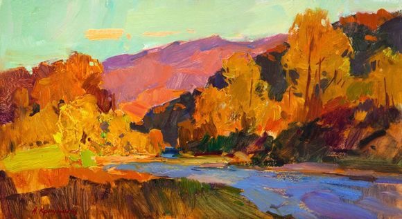
Butterscotch
You may see this and think it’s pretty basic for fall. But what sets this shade apart is its boldness. (Think: less mustard, more brass) it’s like the punchy younger sister of the tried-and-true golden hue.
Sun Valley
(Benjamin Moore 350)
You’ll see this color on Pantone’s Autumn/Winter 2019/2020 list of colors!
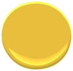
Lavender
This is by far the least conventional color for this season, yet it seems right at home. It balances out the vibrancy of butterscotch and stands out with warm neutrals (see below for this season’s warm neutrals). Lavender’s hint of gray is reminiscent of the cloudy days to come.
North Cascades
(Benjamin Moore 1411)
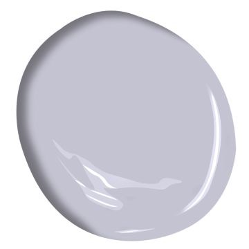
Vanilla
As truly wonderful as fall is, who else wants it to stay warm for a little while longer? This creamy off white will give you all the bright and happy vibes as the days get cooler.
Ivory White
(Benjamin Moore 925)
Pro-Tip: use this color throughout your home in timeless accessories, wall decor, or throw pillows so you don’t have to switch them out every season and you can enjoy the trend while it’s still big.
Persimmon
Here’s another twist to a fall favorite. Persimmon takes after the fruit for which it was named— sweet and savory. At first glance, the bold orange hue packs a powerful statement. It’s simmered down by the feminine pink undertone. Instead of red or orange, use persimmon in your natural elements for fall decorating, the fruit not excluded.
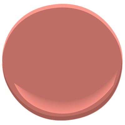
Persimmon
(Benjamin Moore 2088-40)
Griege
While this may not be something new, it’s worth noting. Like the warm vanilla hue mentioned earlier, this combo grey-beige pays homage to the warmer months but transitions well into the chilly days ahead. Pair this color with any of the one’s above (or any other color, really) to let the brighter hue shine.
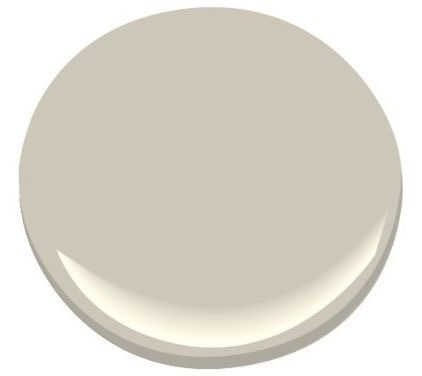
Revere Pewter
(Benjamin Moore HC-172)
For more autumn decor help, head over to Elle Decor for 32 Fall Decorating Ideas for a Stylish and Cozy Home.