
Many of us know how involved choosing a color can be. Quite a few factors influence a color’s nature, its perception, and its performance. Knowing how lighting, undertones, surroundings affect a hue can improve your ability to distinguish and settle on a hue.
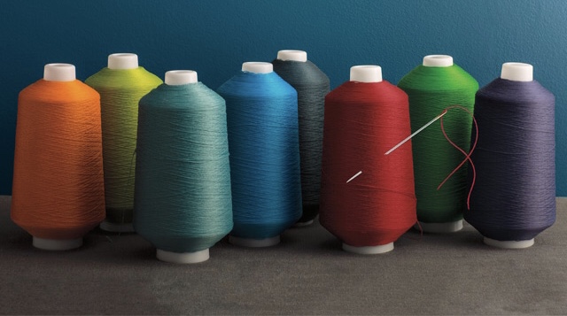
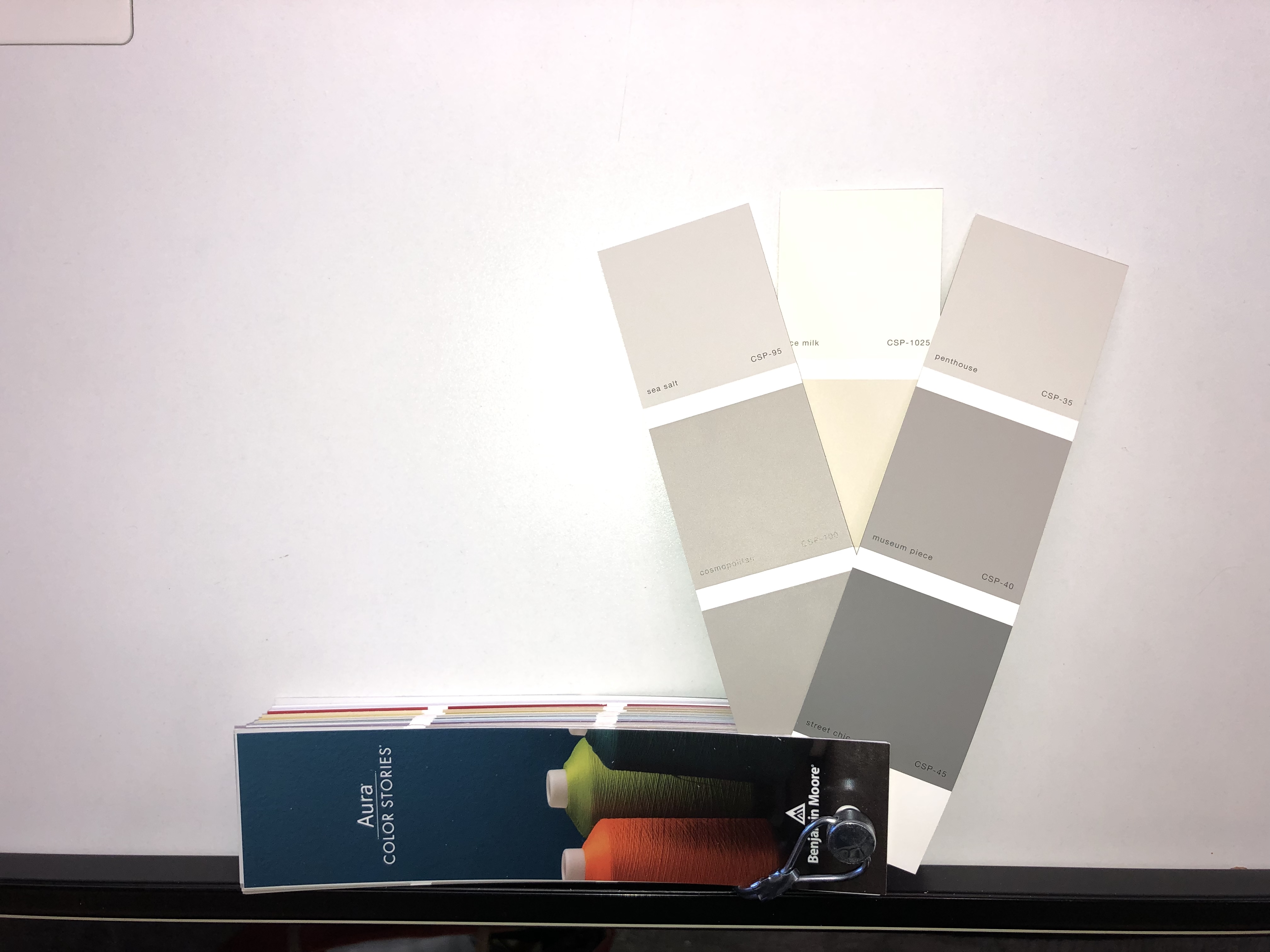
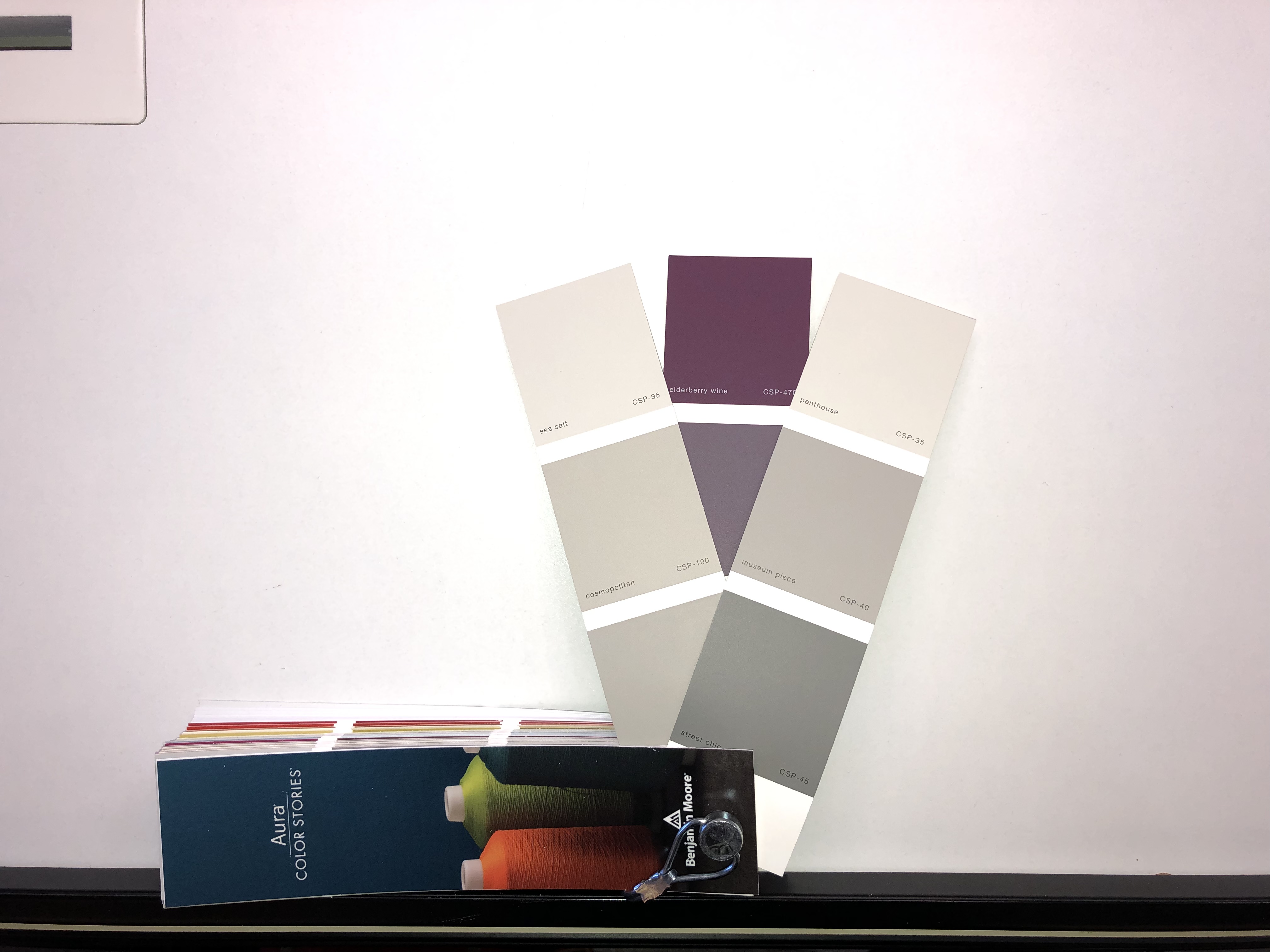
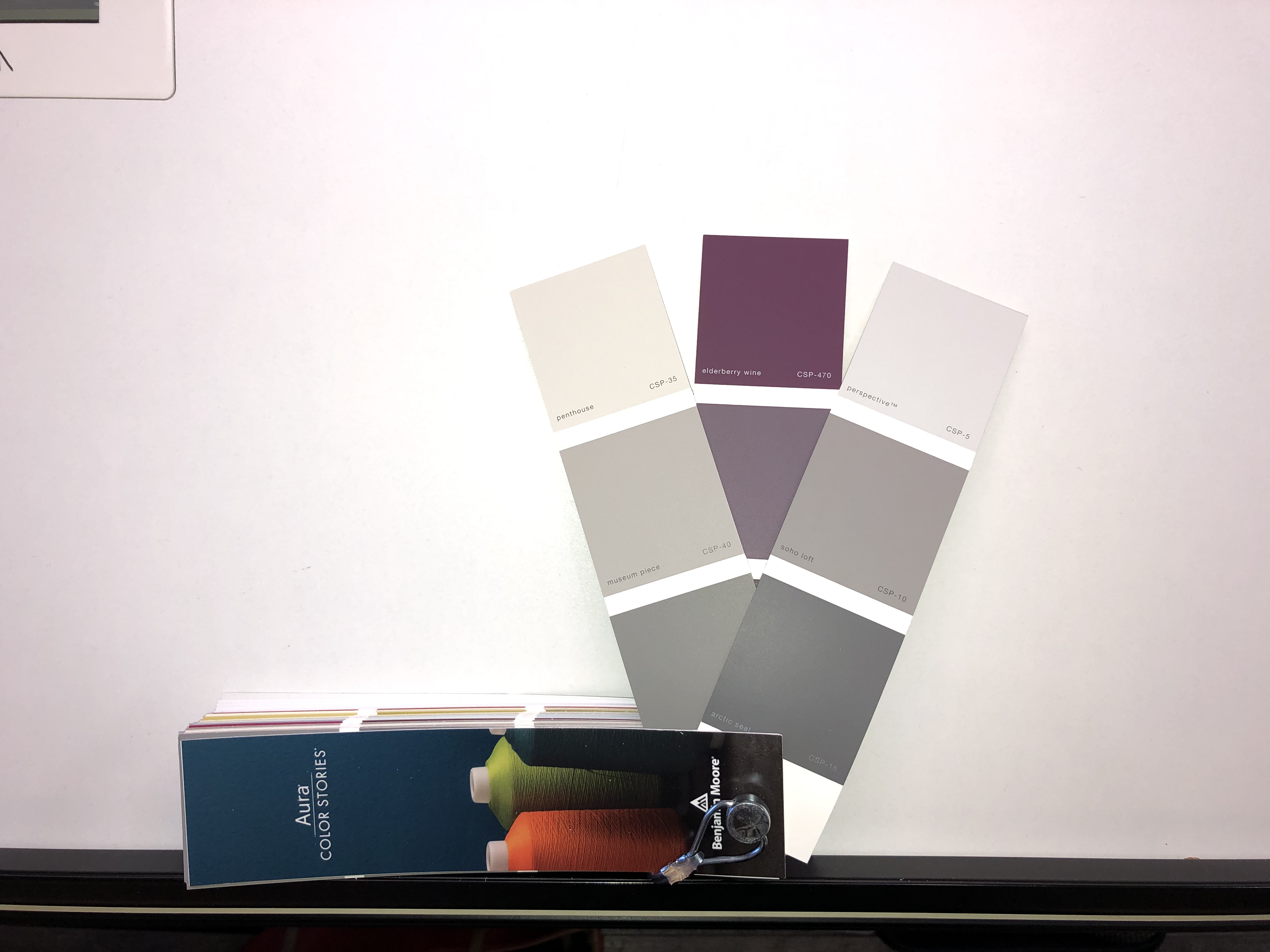
Before we dive into the science behind color, let’s talk about aura color stories. These 240 uniquely-formulated hues embark onto a new playing field in design. They’re dimensional, full of life, and never include black or gray in their mix. Therefore, the colors respond to light in a whole new way. Enhance your home with Benjamin Moore’s Aura interior paint and its exclusive partner, aura color stories. Check them all out here.
Lighting
Surely you’ve had to “look at something in new light,” whether it was a problem to solve or a judgement to make. Well, that approach absolutely applies to color, as well. From room to room, environment can drastically change how a hue is perceived. Remember how they can have warm or cool tone? This also applies to light. While traditional incandescent’s are considered warm, modern LED lamps are much cooler (if not freezing cold!). Each type of light will ultimately affect the mood of your space so it’s important to look at the color in all lights when choosing new decor.
Color test 1
-
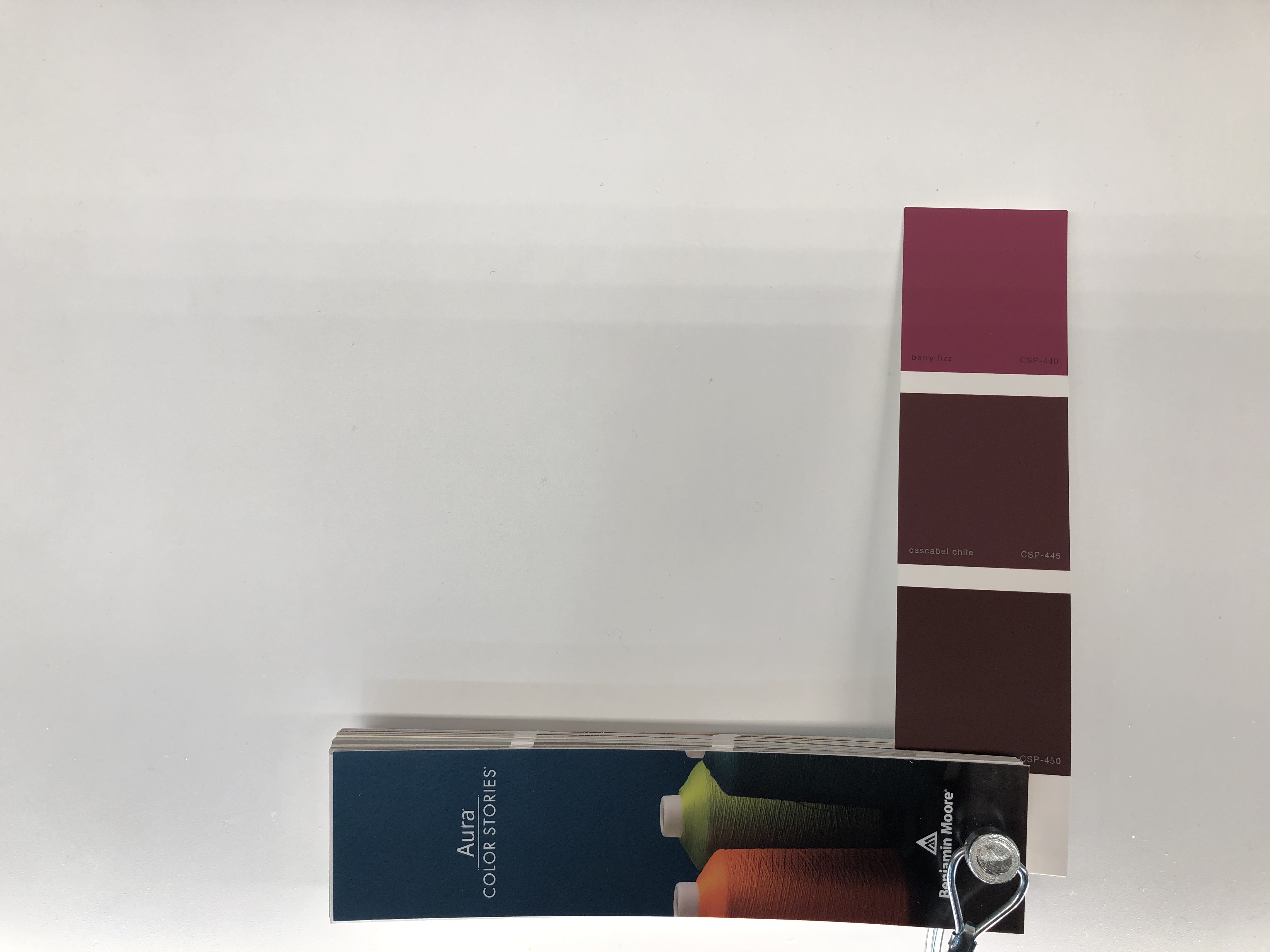
- Colors under warm LED bulbs (mimics incandescent light)
-
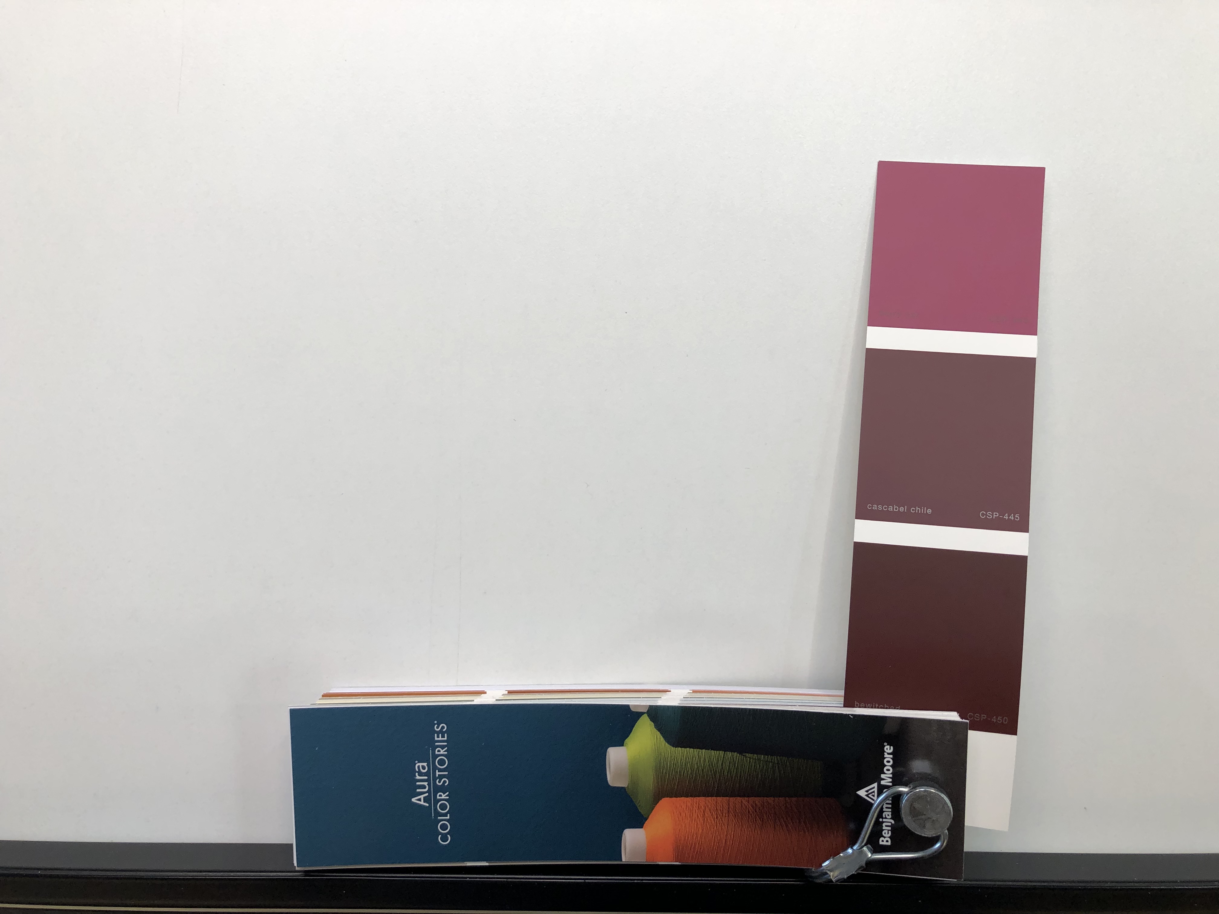
- Colors under cool LED bulbs
-
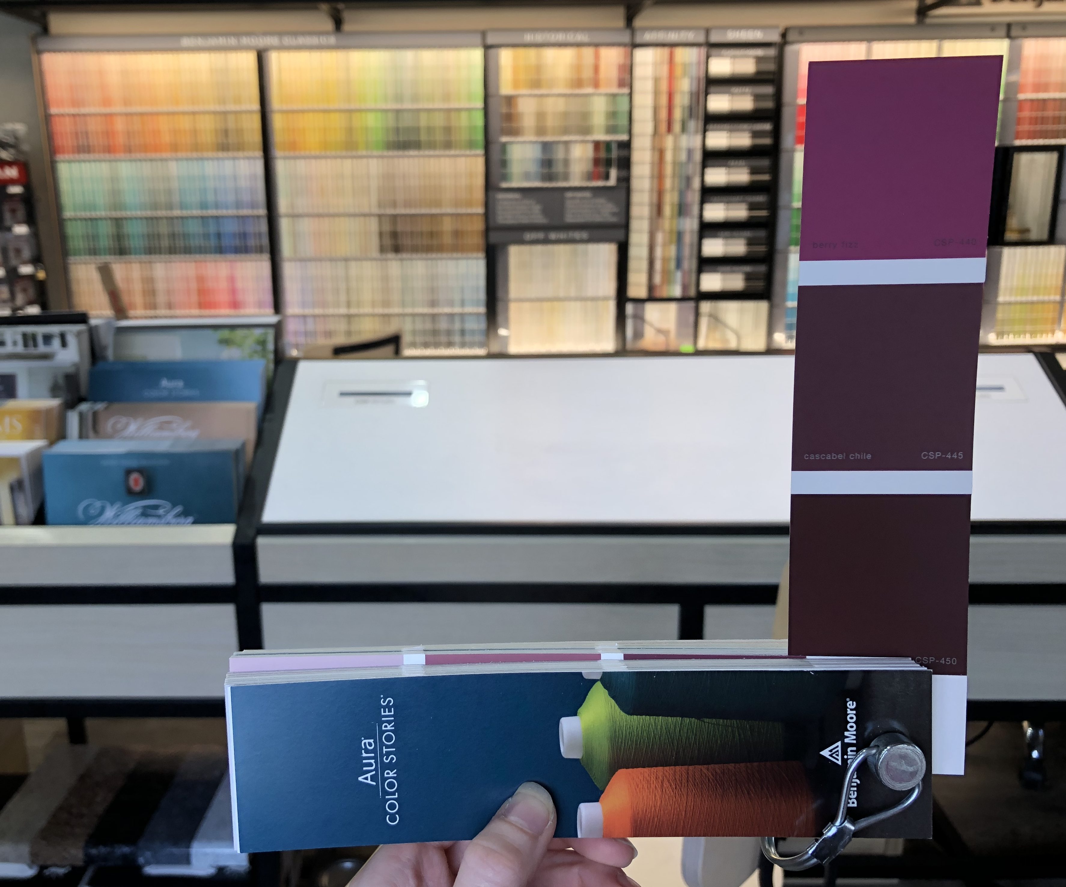
- Colors in natural light
In the images above, we see the same three colors (aura color stories berry fizz 440, casabel chile 445, bewitched 450) in three different lighting scenarios. What this does is pull out particular characteristics you may not notice right away.
For example, in the first image you can see these colors are deep magenta or burgundy. There is no doubt they would appear very rich in a warm-lit space, making them great candidates for a formal dining room or library. However, when we move them to LED lights (middle), a reddish cast comes to each hue. They’d be perfect with LED lights in a modern bohemian setting. Lastly, let’s take a look at our swatches in natural light. Here’s how a color appears without the influence of any artificial light. So, essentially this would be the most accurate representation of the colors.
UNDERTONES
Undertones are the subtelties that seemingly lie under the surface of a color. These little hints can be seen best when comparing two similar hues. They enhance the appearance of a color and create variety that is needed in design.
A good place to start identifying undertones is with a neutral hue. Because of their subdeued nature, it is easier to distinguish slight changes in color. Let’s take a closer look at a contemporary neutral— gray.
What makes one gray “cool” or “warm”, you ask? It’s the primary hue that defines it’s undertone. You may notice while these swatches are next to one another that colors are accentuated in the warm and cool gray. Undertones can be drawn out in a negative way, which is why certain hues just don’t work well with together.
Color test 2
-
- Warm Gray, in comparison to beige, becomes a truer gray, while you see the real True Gray cools down.
-
- Alternatively, we see purple draw out the yellow undertones in the Warm Gray, and the True Gray become slightly warmer.
-

- The same beige causes the Cool gray to appear more purple-y gray and our True Gray becomes the warmer hue.
-
- And the same purple causes our True Gray to turn into a greige when next to the Cool Gray.
Surroundings
Other colors influence how one is seen. Likewise in the example above, we see how each gray swatch adapted according to the other swatches near it. This concept is not only relevant with color, but also applies to furnishings, wood tones, and lighting. All of these factors will have warm or cool elements about them that affect your color choices. Since this is the case, you must factor in how a color will harmonize with other items, and in the space as a whole.
Why do two colors, put next to each other, sing?
— Pablo Picasso
To give you an example, think about which colors and accents you would use in a Mid-Century or Scandinavian home. You can easily introduce a bold, bright green here. These spaces thrive with the use of rich color in artwork, furniture, and other decor. As a result, you almost expect to see intense accents among the variety of wood tones and simple furniture pieces.
However, decorating with a vibrant chartreuse would not fit in a contemporary family home. Why not? Because it is drastically more intense than the rest of the space. This type of environment calls for softer accents that are similar in value to the overall color scheme.
-
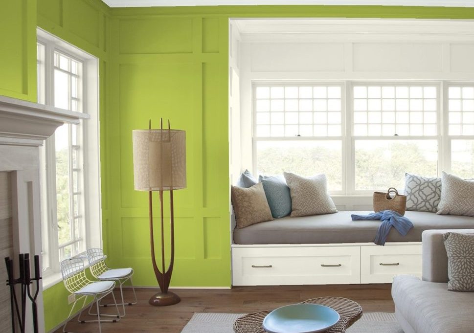
- limeade (CSP-865) is not the best choice for this contemporary space.
-
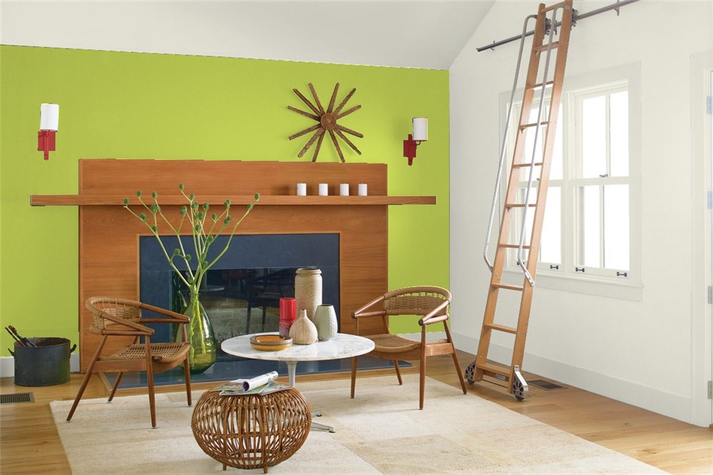
- However, it fits right in along the fireplace wall of this mid century sitting room.
See how versatile one hue may be? The next time you’re decorating, be sure to test out your color palettes. Then you’ll be sure of your color choice and mood for the space.
Let us help you find your color and schedule a consultation with one of out designers today!
DIY DETAILS

Once you’ve found your colors, here’s a creative way to incorporate an accent wall in your design. You can ombre one hue with a variety of shades or fade a color into a totally different one (think: sunrise). With the help of painter’s tape, a few rollers, and a handful of Benjamin Moore’s pint size paint samples, you can easily add this trendy accent wall to your decor.
Pro Tip: Benjamin Moore’s color swatches are specifically designed with an ombré affect. Meaning it’s even easier to pick all the right shades for your project!
What You Need
- Drop cloth
- Painters tape
- Two small buckets
- 2-3 paint colors, each 3-5 shades apart from dark to light
- Stir sticks
- Paint rollers and trays for each paint color
- Large paintbrushes
Step 1: Prep
You’ll want to be sure the rest of you room stays mess-free, so prepare your workspace by taping around trim and baseboards with painters tape. And don’t forget the drop cloth!
Step 2: Mix
In one bucket, mix equal parts of your darkest and medium paint colors. In a second bucket, mix equal portions of the medium and light shades.
Step 3: Paint
Working in small areas so your paint doesn’t dry up, paint the bottom portion of the wall the darkest paint color. Leaving a little wall space between each shade, start painting at the bottom of the wall with your darkest color. Then, continue upward with the medium and lightest shades.
While the wall is still wet, brush your dark-medium paint mix onto the first gap and blend the layers together. Repeat for every layer until you’ve achieved your desired ombre effect. Let it dry, then remove the painters tape.
And voila! Your fresh, modern accent wall is complete.